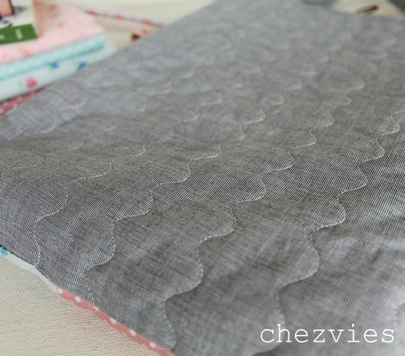
When you are selling online, a GOOD, professional looking photography is a MUST. I've done a lot of reading {and I still do} on how to take a good product photography.
I follow these few simple guides:
1.Natural Light is the BEST
But not direct light. Which means, take your photos in the room which doesn't get direct sunlight. I have a small balcony adjacent to my room, which is has a good natural light. The balcony is facing North. The best time is before 11 am and around 3-4 pm. And you ask WHY? because indirect natural light will give you the best color of your product.
 |
| This is unedited, taken under indirect natural light |
My sewing room has natural light most of the time, but it's facing East, so it gets direct light most of the time. When I took photo in my sewing room, the result is either too bright or too dark.
Never take your photos at night, even with sufficient light
I took this photo at night with a poor background and I had a tough time editing it.
2. NO FLASH
NEVER use flash light. The best picture is the one which doesn't need much of editing. Whether you take with DSLR camera, pocket camera or your mobile camera. Flash will a harsh shadow on your product and you will have a hard time editing it. Especially if you are not expert in it. I don't know how to use photoshop, I love using picasa or photoscape which is easier.
 |
| with flash |
 |
| without flash |
3. BACKGROUND
Background is very important. Remember your product is the CENTER of attention. So, to many thing in the background will distract the buyer. Use minimal prop which can enhance your product. If your are not sure what prop you should use, white background always works best.
I'm using this inexpensive canvas board as my background. I put it on top of my trunk, and cover it with tablecloth when I don't need it. Since it's very dusty here I make sure to cover it.
As much as you can, try to convey the uniqueness of your product. Less is always better. I usually like to browse craft magazines and pinterest to get ideas on how to use the prop.
Make sure the background is less busy or less colorful than your product. The FOCUS is on your product, not the green leaves or the Chrystal vase behind the product.
Look at this photo, the idea was to show that you can use the mat for the chrystal vase. But the vase is too big that you cannot see the design of the mat
Compare to this one
The simple prop makes the mats pop out
4. Camera Setting
It's always best to use camera with higher resolution. At least 8 mega pixel and above for Android Phone. For iPhone 5 mp is sufficient to give an editable and clear picture. Why? because you need to crop your picture. If you are using lower resolution camera, when you crop it, the picture will not give you a clear image and sometimes it breaks/grainy
 |
The size of an image taken at different resolutions
You can read more about Digital Camera Resolution HERE
|
If you have DSLR but not very familiar with it, go with the automatic setting. In my Canon its the P sign. When I am in a hurry, that's what I do. If I am using mobile camera I always turn OFF the flash.
Always click many photos, try different angles, and different props. For one product I took around 15-20 pics.
Of course DSLR camera gives a better result, especially for close up pictures
and it also can capture more natural color of the product. Especially for my fabric shop I try to always use my DSLR
But
some photos in my handmade ETSY shop was taken using my mobile camera. If the light is good, sometimes it gives a good natural color which doesn't need much editing.
It's as simple as that. All you need is an extra time and patience.
I'm not an expert and I'm still learning. If you want to know more
Happy Clicking


